X-Y Plot
The New Plot Window | X-Y Plot command allows one or more variable(s) defined in the Parametric Table, the Lookup Table, the Arrays Table or the Integral Table to be plotted as a function of any other variable in the table. The plot produced with this command can be modified to be a line, scatter, or area plot by selecting different options in the Modify Plot. The plot is drawn in a new tabbed plot window. The information needed to produce the plot is specified in the New Plot Setup dialog window. All of the information specified in this dialog window can be modified later using the Modify Axes and Modify Plot commands.
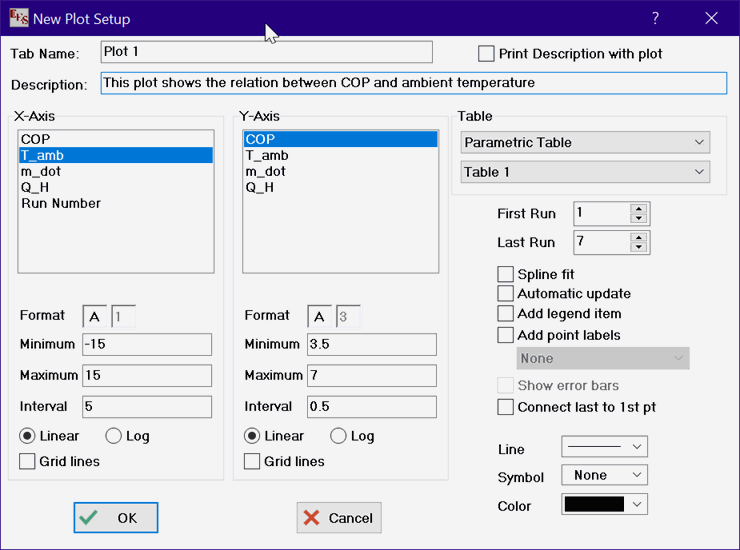
The Tab Name is the name that will appear on the tab of the Plot Window. The name you enter can be up to 80 characters in length, but shorter tab names are preferable so that they fit on the tabs. The Description edit field can be used to enter a description of the plot contents or any other information you wish to save. The description can be up to 255 characters in length. It is saved with the Plot window. The description will be printed when the plot is printed if the check box at the upper right of the dialog is checked. The description and printing option can be later modified by right-clicking on the tab for this plot in the Plot Window.
Select the table that is to be plotted with drop-down controls in the upper right of the dialog window. (The width of the dialog window and control that displays the names of the tables can be increased, should that be necessary, by dragging the right border of the dialog window to the right.) The range of runs (or rows) for which values will be plotted is indicated in the input boxes at the upper right just below the table selection controls. The variables to be plotted on the X and Y axes are selected from the lists by clicking on their names, using the scroll bar or up/down arrow keys, if necessary to bring the variable names into view. One or more Y-axis variables can be selected. Clicking on an unselected variable name selects that variable, while clicking on a selected variable unselects it. A separate plot line will be generated for each selected Y-axis variable. All selected variables will be plotted with the same axis scale. Strings, rather than numerical values can be plotted on the X-axis. See Plotting Strings for details.
The two fields to the right of the word Format control the format of the numbers appearing in the scale for each axis. The first field can be an A, E or F. F and E format the numbers on the scale with a fixed number of decimal places or exponential notation, respectively. The number of decimal places (for fixed or exponential notation) or is entered in the second field as a single digit number between 0 and 9. A (for automatic) chooses the E or F option format and the number of digits automatically to produce an appropriate presentation of results. The Minimum, Maximum, and Interval fields control the scaling of each axis. These fields will initially be filled with values that provide an appropriate choice of scale. The axis number format and number of digits will also be automatically selected. Any of these defaults may be changed. In the Professional license, the minimum, maximum and interval values may be supplied using EES variables. In this case, the name of the EES variable is provided in place of the numerical value.
The axis can be linearly or logarithmically scaled by selecting the appropriate radio button. Grid lines will be drawn on the X and/or Y axes if the Grid Lines check boxes are selected (shown with an X). The number of grid lines or major tick marks drawn for each axis is determined by the value entered in the Interval field.
The plot may be formatted in a variety of ways. Clicking in the control to the right of Line will display a list of the available line types. Click on the desired line type or make a selection with the up and down arrow keys. The plot symbol and line color are chosen in a similar manner. The color menu offers a list of 16 line colors. However, once created, the Modify Plot dialog can be used to set the line color to any desired color. If more than one Y-axis variable is selected, the color list box will display 'auto'. With the 'auto' option, the color for each plot line will be automatically selected by EES so that each plot line has a different color. This feature can be overridden by simply selecting the color.
The 'Spline fit' control will use cubic spline interpolation to draw a smooth curve through the data points.
When the Automatic update control is selected, the plot will use the current data in the table from which the plot was developed, rather than the data which existed when the plot was first drawn. The data can be plotted from the Parametric, Lookup, Arrays, or Integral tables. Any change in the data will cause the plot to be redrawn before it is displayed when this option is selected.
The 'Add legend item' checkbox control will, if checked, place a text item with the name of the variable being plotted preceded by the plot symbol at the upper left of the plot rectangle. Subsequent legend items will be placed below the previous item. This feature makes the construction of a plot legend easy. The text items can, of course, be moved to other locations, changed, or deleted using the Plot Window controls.
The 'Add point labels' check box allows a text label to be associated with each plotted point. This options is often useful when plotting data from the Arrays table. In this case, selecting this checkbox will generate a separate label for each plotted point containing the array index value. The label is initially placed to the right and slightly above the point, but it can be moved. The position of the label relative to the point will remain intact if the plot is rescaled. This option is very useful when superimposing calculated thermodynamic state points on a Property plot, such as a P-h diagram. Plotting the arrays effectively places the cycle diagram on the property plot and with this option enabled, labels the points. If the plotted line is deleted, the labels that were generated for the points on this line will also be removed. This option is also available for the Parametric and Lookup tables. By default, the run (or row) numbers in the table can be associated with each point. The Professional license allows the selection of a column in the table containing string variables from the menu control below the Add point labels check box. In this case, the labels associated with each point are set to the strings in the selected data column.
The 'Show error bars' checkbox control is enabled only after the Uncertainty Propagation Table calculations are completed. In this case, the propagated uncertainty of the selected variable is displayed in the Parametric table following its value. If this selected variable is plotted, the 'Show error bars' control will be active and provide the option of displaying error bars to represent the propagated uncertainty. Note that error bars can be drawn for any plotted variable, independent of the Uncertainty Propagation Table calculations. To place error bars on an existing plot, select Modify Plot from the Plot menu or double click (or right click) the mouse within the plot rectangle. The Modify Plot dialog has controls that allow the Specify Error Bar Information dialog to be displayed. Symmetric or unsymmetric errors bars can be drawn for the X and Y axis variables on each plot.
The 'Connect last to 1st point' checkbox will draw a line from the last point to the first point. This option is useful when plotting the state points of a thermodynamic cycle.
When a new plot is created, the size of the plot and the characteristics of the axis scales are determined by the settings of the Plot Options in the Preferences dialog.
See also: